Follow along
You can download this .Rmd file below if you’d like to follow along. I do have a few hidden notes you can disregard. This document is a distill_article, so you may want to change to an html_document to knit. You will also need to delete any image references to properly knit, since you won’t have those images.
Resources
Explanatory Model Analysis by Przemyslaw Biecek and Tomasz Burzykowski, section III: Dataset Level chapters and chapter 10: Ceteris-paribus Profiles.
Interpretable Machine Learning chapter of HOML by by Bradley Boehmke & Brandon Greenwell.
Interpretable Machine Learning book by Christoph Molnar, specifically chapter 5.
Set up
First, we load the libraries we will use. There will be some new ones you’ll need to install.
library(tidyverse)         # for reading in data, graphing, and cleaning
library(tidymodels)        # for modeling ... tidily
library(lubridate)         # for dates
library(stacks)            # for stacking models
library(moderndive)        # for King County housing data
library(vip)               # for variable importance plots
library(DALEX)             # moDel Agnostic Language for Exploration and eXplanation (for model interpretation)
library(DALEXtra)          # for extension of DALEX
library(patchwork)         # for combining plots nicely
library(rmarkdown)         # for paged tables
theme_set(theme_minimal()) # my favorite ggplot2 theme :)
Then we load the data we will use throughout this tutorial and do some modifications.
Intro
In your machine learning course, you probably spent some time discussing pros and cons of the different types of model or algorithms. If you think way back to Intro to Statistical Modeling, you probably remember spending A LOT of time interpreting linear and logistic regression models. That is one huge advantage to those models: we can easily state the relationship between the predictors and the response variables just using the coefficients of the model. Even when we have somewhat complex models that include things like interaction terms, there is often a fairly easy interpretation.
As we use more complex algorithms like random forests, gradient boosted machines, and deep learning, explaining the model becomes quite tricky. But it is important to try to understand. This is especially true in cases where the model is being applied to or affecting people.
We will learn ways of interpreting our models globally and locally. This tutorial focuses on global model interpretations, where we try to understand the overall relationships between the predictor variables and the response. Next week, we’ll learn about local model interpretations where we try to understand the impact variables have on individual observations.
Build some models
Let’s use the King County house price data again. We will build a lasso model, like in the Intro to tidymodels tutorial and the random forest model from the stacking tutorial. We wouldn’t have to use log_price, but I’m going to keep it that way so I can reference some of the output from that model.
Recreate the lasso model (I used select_best() rather than select_one_std_err() like I did originally):
set.seed(327) #for reproducibility

# Randomly assigns 75% of the data to training.
house_split <- initial_split(house_prices,
                             prop = .75)
house_training <- training(house_split)
house_testing <- testing(house_split)

# Quick look at head of training to assure what I have in my Rmd file on my computer is indeed what I see once I knit the file

house_training %>% head()
# lasso recipe and transformation steps
house_recipe <- recipe(log_price ~ .,
                       data = house_training) %>%
  step_rm(sqft_living15, sqft_lot15) %>%
  step_log(starts_with("sqft"),
           -sqft_basement,
           base = 10) %>%
  step_mutate(grade = as.character(grade),
              grade = fct_relevel(
                        case_when(
                          grade %in% "1":"6"   ~ "below_average",
                          grade %in% "10":"13" ~ "high",
                          TRUE ~ grade
                        ),
                        "below_average","7","8","9","high"),
              basement = as.numeric(sqft_basement == 0),
              renovated = as.numeric(yr_renovated == 0),
              view = as.numeric(view == 0),
              waterfront = as.numeric(waterfront),
              age_at_sale = year(date) - yr_built)%>%
  step_rm(sqft_basement,
          yr_renovated,
          yr_built) %>%
  step_date(date,
            features = "month") %>%
  update_role(all_of(c("id",
                       "date",
                       "zipcode",
                       "lat",
                       "long")),
              new_role = "evaluative") %>%
  step_dummy(all_nominal(),
             -all_outcomes(),
             -has_role(match = "evaluative")) %>%
  step_normalize(all_predictors(),
                 -all_nominal())

#define lasso model
house_lasso_mod <-
  linear_reg(mixture = 1) %>%
  set_engine("glmnet") %>%
  set_args(penalty = tune()) %>%
  set_mode("regression")

# create workflow
house_lasso_wf <-
  workflow() %>%
  add_recipe(house_recipe) %>%
  add_model(house_lasso_mod)

# create cv samples
set.seed(1211) # for reproducibility
house_cv <- vfold_cv(house_training, v = 5)


# penalty grid - changed to 10 levels
penalty_grid <- grid_regular(penalty(),
                             levels = 10)

# tune the model
house_lasso_tune <-
  house_lasso_wf %>%
  tune_grid(
    resamples = house_cv,
    grid = penalty_grid
    )

# choose the best penalty
best_param <- house_lasso_tune %>%
  select_best(metric = "rmse")

# finalize workflow
house_lasso_final_wf <- house_lasso_wf %>%
  finalize_workflow(best_param)

# fit final model
house_lasso_final_mod <- house_lasso_final_wf %>%
  fit(data = house_training)

# compute the training rmse - we'll compare to this later
house_training %>%
  select(log_price) %>%
  bind_cols(
    predict(house_lasso_final_mod,
            new_data = house_training)
    ) %>%
  summarize(
    training_rmse = sqrt(mean((log_price - .pred)^2))
    )
Recreate the random forest model:
# set up recipe and transformation steps and roles
ranger_recipe <-
  recipe(formula = log_price ~ .,
         data = house_training) %>%
  step_date(date,
            features = "month") %>%
  # Make these evaluative variables, not included in modeling
  update_role(all_of(c("id",
                       "date")),
              new_role = "evaluative")

#define model
ranger_spec <-
  rand_forest(mtry = 6,
              min_n = 10,
              trees = 200) %>%
  set_mode("regression") %>%
  set_engine("ranger")

#create workflow
ranger_workflow <-
  workflow() %>%
  add_recipe(ranger_recipe) %>%
  add_model(ranger_spec)

#fit the model
set.seed(712) # for reproducibility - random sampling in random forest choosing number of variables
ranger_fit <- ranger_workflow %>%
  fit(house_training)

# compute the training rmse - we'll compare to this later
house_training %>%
  select(log_price) %>%
  bind_cols(predict(ranger_fit, new_data = house_training)) %>%
  summarize(training_rmse = sqrt(mean((log_price - .pred)^2)))
Global Model Interpretation
We will be using some functions from the DALEX and DALEXtra packages for model explanation. The first step is to create an “explainer”. According the documentation, this is “an object that provides a uniform interface for different models.” There is a generic explain() function, but we will use the explain_tidymodels() function which is set up to work well with models built with the tidymodels framework. We need to provide the model; data, which is the dataset we will be using for interpretation WITHOUT the outcome variable; and y which is a vector of the outcome variable that corresponds to the same observations from the data argument. We will also provide a label, an optional argument to identify our models.
(NOTE: I used the training data. I’m not positive which data should be used, to be honest, but most of the examples I saw used the training data, so that’s what I went with. Christoph Molnar discusses this in-depth regarding Variable Importance.)
Create explainer for the lasso model:
lasso_explain <-
  explain_tidymodels(
    model = house_lasso_final_mod,
    data = house_training %>% select(-log_price),
    y = house_training %>%  pull(log_price),
    label = "lasso"
  )
Preparation of a new explainer is initiated
-> model label : lasso
-> data : 16209 rows 20 cols
-> data : tibble converted into a data.frame
-> target variable : 16209 values
-> predict function : yhat.workflow will be used ( [33m default [39m )
-> predicted values : No value for predict function target column. ( [33m default [39m )
-> model_info : package tidymodels , ver. 0.1.3 , task regression ( [33m default [39m )
-> predicted values : numerical, min = 5.040734 , mean = 5.666335 , max = 6.55555
-> residual function : difference between y and yhat ( [33m default [39m )
-> residuals : numerical, min = -0.5974896 , mean = -3.466169e-14 , max = 0.6397755
[32m A new explainer has been created! [39m Create explainer for the random forest model:
rf_explain <-
  explain_tidymodels(
    model = ranger_fit,
    data = house_training %>% select(-log_price),
    y = house_training %>%  pull(log_price),
    label = "rf"
  )
Preparation of a new explainer is initiated
-> model label : rf
-> data : 16209 rows 20 cols
-> data : tibble converted into a data.frame
-> target variable : 16209 values
-> predict function : yhat.workflow will be used ( [33m default [39m )
-> predicted values : No value for predict function target column. ( [33m default [39m )
-> model_info : package tidymodels , ver. 0.1.3 , task regression ( [33m default [39m )
-> predicted values : numerical, min = 5.061859 , mean = 5.665864 , max = 6.610748
-> residual function : difference between y and yhat ( [33m default [39m )
-> residuals : numerical, min = -0.3192239 , mean = 0.0004716477 , max = 0.3196729
[32m A new explainer has been created! [39m Model performance
One way to explain a model is through its performance, using statistics like RMSE for models involving a quantitative response variable or accuracy or AUC for models with a binary response variable. We already know how to look at these statistics, but we’ll see how to use some functions from DALEX and DALEXtra to do it.
The model_performance() function gives some overall model evaluation metrics. We are using the training data right now, so these metrics will be different from the cross-validated or test data results. They do match the training rmse I computed in the previous section (see the training_rmse).
lasso_mod_perf <- model_performance(lasso_explain)
rf_mod_perf <-  model_performance(rf_explain)

# lasso model performance
lasso_mod_perf
Measures for:  regression
mse        : 0.01818788
rmse       : 0.1348624
r2         : 0.6504362
mad        : 0.0902

Residuals:
          0%          10%          20%          30%          40%
-0.597489649 -0.173182042 -0.113993859 -0.069127971 -0.029404326
         50%          60%          70%          80%          90%
 0.006192225  0.038958946  0.071960688  0.109152600  0.162869669
        100%
 0.639775533
# random forest model performance
rf_mod_perf
Measures for:  regression
mse        : 0.001601629
rmse       : 0.04002035
r2         : 0.9692173
mad        : 0.01948094

Residuals:
           0%           10%           20%           30%           40%
-0.3192239433 -0.0432462386 -0.0241317667 -0.0134641634 -0.0057208815
          50%           60%           70%           80%           90%
 0.0008961911  0.0081215562  0.0160623670  0.0261501276  0.0433573013
         100%
 0.3196729315
We can plot the results using the plot() function. See ?plot.model_performance for info on the different geom options (you may need to adjust the fig.width and fig.height in the R code chunk options to make this look nice). For example, with binary outcome models, you may be more interested in an ROC curve (geom = "roc").
Below we plot both histograms of residuals and boxplots of the absolute residuals. (In my original write-up of this function, there was an issue that has since been resolved).
hist_plot <-
  plot(lasso_mod_perf,
       rf_mod_perf,
       geom = "histogram")
box_plot <-
  plot(lasso_mod_perf,
       rf_mod_perf,
       geom = "boxplot")

hist_plot + box_plot
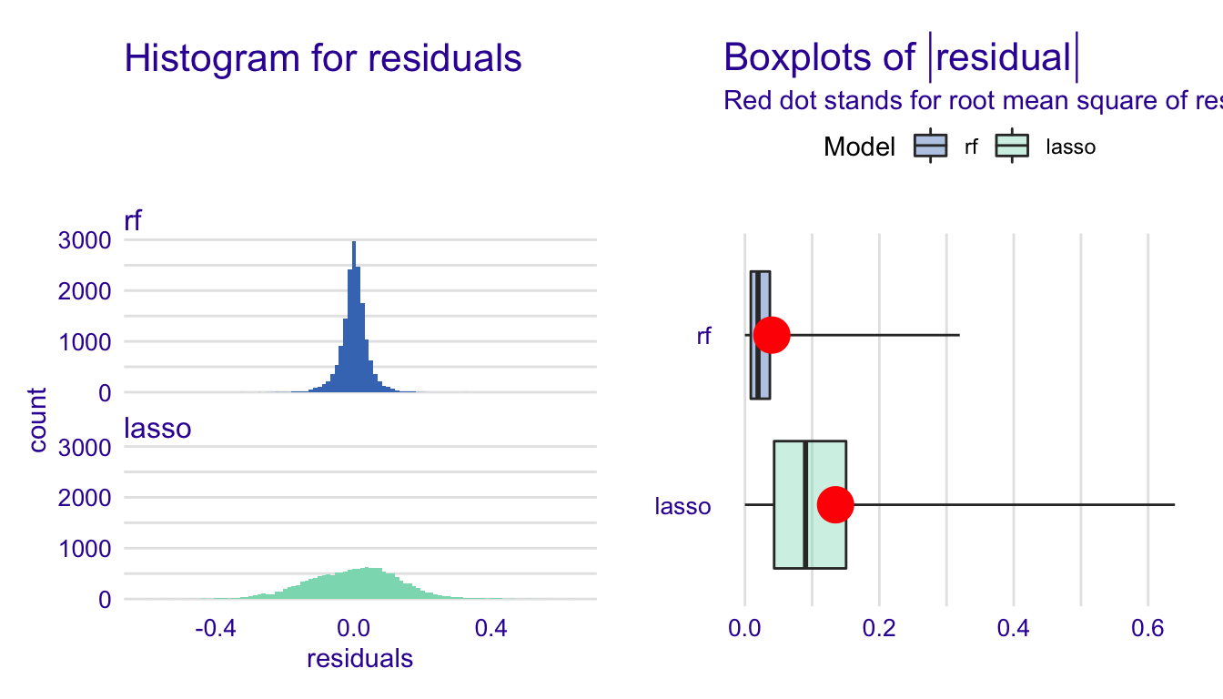
What can we learn from these plots? Unlike a metric like RMSE, which is just one number, this gives us a good idea of the distribution of the residuals. So, we have a sense of the center, spread, and shape of the distribution. We can also note any odd or interesting values.
Variable importance
You have already seen at least one variable importance plot, but let’s dig in a bit more into how they are constructed. Boehmke and Greenwell give an excellent, simple explanation in section 16.3.1 of their Hands on Machine Learning in R textbook. I will give a slightly modified version below.
- Compute the performance metric for the model (RMSE, accuracy, etc.).
- For each variable in the model, do the following:
- Permute the values. This means you randomly mix up the values for that variable across observations. For example, if we have ten observations of a variable with the values (2,3,4,3,2,5,6,7,8,5), a possible permutation would be (5,2,8,3,4,6,2,3,5,7).
- Fit the model again with this new permuted variable in place of the original variable.
- Compute the performance metric of interest (RMSE, accuracy, etc.).
- Find the variable’s importance by comparing the new performance metric to the original model’s performance metric (difference or ratio, usually scaled)
- Sort variables by descending importance
This procedure could be repeated multiple times to obtain an estimate of the variability of importance.
Let’s consider a model with a quantitative response. If permuting variable x greatly increases the RMSE relative to permuting other variables, then variable x would be important. With a binary response, permuted variables that greatly decrease the accuracy relative to other variables would be important. Variable importance is a nice, easy interpretation. It tells us how much the model error would increase if that variable weren’t in the model.
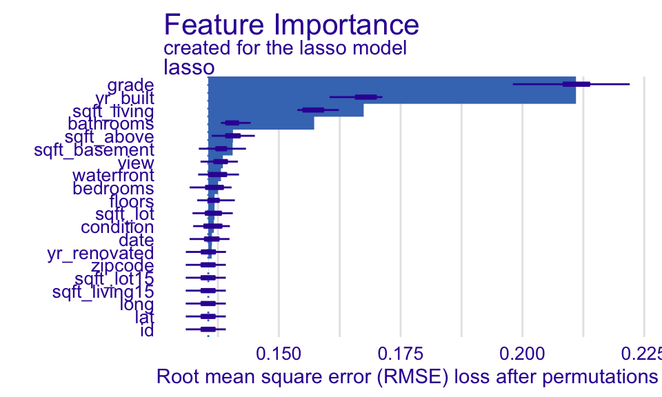
Now, let’s use some functions from DALEX to help us compute and graph variable importance. First, we use the model_parts() function. The only argument we need to provide is an explainer. By default, it will use RMSE for regression and 1-AUC for classification for the loss_function - it is possible to write your own. The type argument tells it whether to use the raw loss (default), difference (type = difference) between permuted and original, or ratio (type = ratio) between the permuted and original. The N argument tells it how many observations to sample to do the computation. The default is 1000.
Create a variable (aka feature) importance plot for the lasso model:
set.seed(10) #since we are sampling & permuting, we set a seed so we can replicate the results
lasso_var_imp <-
  model_parts(
    lasso_explain
    )

plot(lasso_var_imp, show_boxplots = TRUE)
Let’s compare this to the variable importance plot we’ve seen before:
house_lasso_final_mod %>%
  pull_workflow_fit() %>%
  vip()
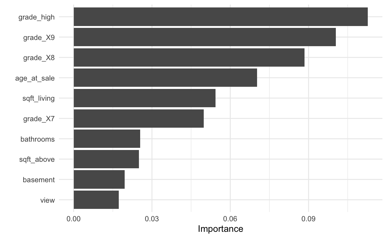
The are definitely some differences. I think the most important one is that this plot treats the dummy variables separately whereas they are treated as a group in the first plot made with the DALEX package. Treating them as a group seems more reasonable to me.
And create a variable importance plot for the random forest model:
set.seed(10) #since we are sampling & permuting, we set a seed so we can replicate the results
rf_var_imp <-
  model_parts(
    rf_explain
    )

plot(rf_var_imp, show_boxplots = TRUE)
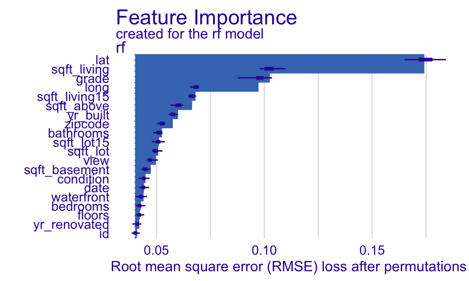
What do these plots tell us? Each set of bar plots starts at the original model RMSE. The length of the bar indicates how much the RMSE increases when that variable is permuted. So, in the random forest model, the RMSE increases the most when lat, the latitude, is permuted. And it looks like that increase is significantly more than any other variable. For the lasso model, permuting grade increases RMSE the most. We should note that latitude and longitude were not included as potential predictor variables in the lasso model.
Ceteris-paribus profiles
These plots are actually a local model interpretation tool, but they will be used in Partial Dependence Plots, a global model interpretation tool. See a more in-depth discussion of ceteris-paribus profiles in Biecek and Burzykowski. The phrase “ceteris parabus” is Latin for all else unchanged, and ceteris parabus profiles, or CP profiles, show how one variable affects the outcome, holding all other variables fixed, for one observation.
Let’s look at an example. The code below extracts the 4th observation from the house_training dataset.
obs4 <- house_training %>%
  slice(4)
obs4
Let’s examine how changing sqft_living for this observation would affect the predicted house price (on the log base ten scale). I am going to use 50 values of sqft_living that fall between the minimum and maximum.
min_sqft <- min(house_training$sqft_living)
max_sqft <- max(house_training$sqft_living)

obs4_many <- obs4 %>%
  #there is probably a better way to do this
  sample_n(size = 50, replace = TRUE) %>%
  select(-sqft_living) %>%
  mutate(sqft_living = seq(min_sqft, max_sqft, length.out = 50)) %>%
  relocate(sqft_living, .after = id)

obs4_many
Now, let’s predict using the lasso model and plot the results.
obs4_many %>%
  select(sqft_living) %>%
  bind_cols(
    predict(house_lasso_final_mod,
            new_data = obs4_many)
  ) %>%
  ggplot(aes(x = sqft_living,
             y = .pred)) +
  geom_line() +
  labs(y = "Predicted Price (log 10)")

Let’s add one more observation:
# different sqft_living values for obs 873
obs873_many <- house_training %>%
  slice(873) %>%
  sample_n(size = 50, replace = TRUE) %>%
  select(-sqft_living) %>%
  mutate(sqft_living = seq(min_sqft, max_sqft, length.out = 50)) %>%
  relocate(sqft_living, .after = id)

# add to obs 4 and predict
# new_data = . uses the data feeding into it

obs4_many %>%
  bind_rows(obs873_many) %>%
  bind_cols(
    predict(house_lasso_final_mod,
            new_data = .)
  ) %>%
  ggplot(aes(x = sqft_living,
             y = .pred,
             color = id)) +
  geom_line() +
  scale_color_discrete(labels = c("Obs 4", "Obs 873")) +
  labs(y = "Predicted Price (log 10)",
       color = "")
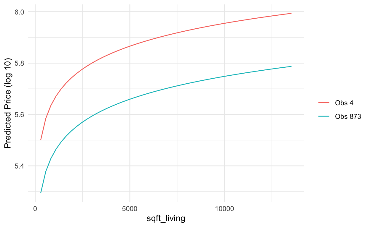
Notice these lines are parellel curves because the lasso model is additive. Because we did a log transformation of sqft_living before fitting the lasso model, it isn’t linear.
Now, let’s see what happens when we do this with the random forest model.
obs4_many %>%
  bind_rows(obs873_many) %>%
  bind_cols(
    predict(ranger_fit,
            new_data = .)
  ) %>%
  ggplot(aes(x = sqft_living,
             y = .pred,
             color = id)) +
  geom_line() +
  scale_color_discrete(labels = c("Obs 4", "Obs 873")) +
  labs(y = "Predicted Price (log 10)",
       color = "")
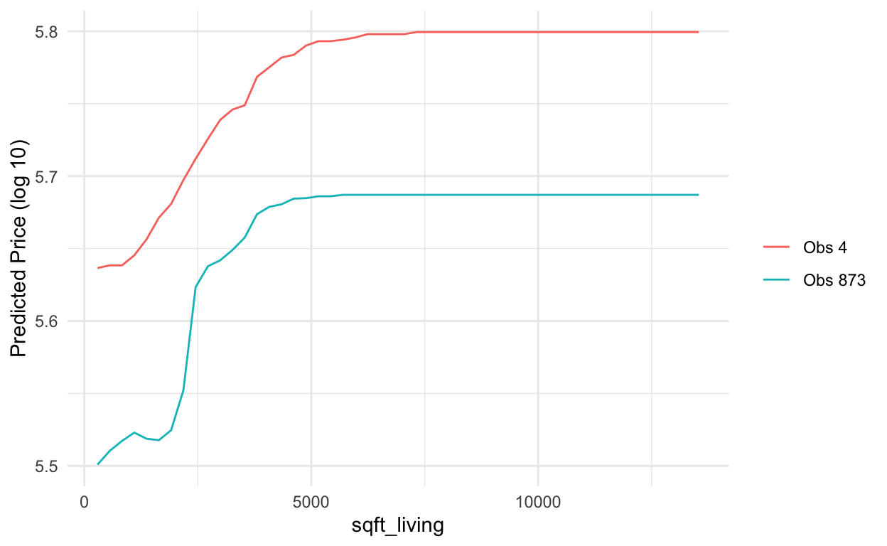
Here we notice that the patterns for each observation are not parallel and are more wiggly than they were in the lasso model. They could even cross.
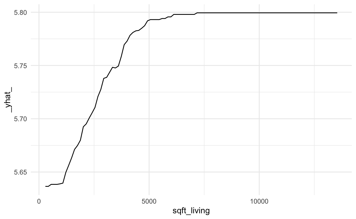
The DALEX library provides some functions for us so we don’t have to do this by hand. Sadly, it seems that not all the functionality is quite ready yet, so we still have to do a little bit of work by hand. First, we create the predict_profile() which is like what we did by hand above when we generated 50 values of sqft_living that fall between the minimum and maximum and then see how changes those values of sqft_living affect predicted house price, holding all other variables constant. Only this function does that for EACH of the variables. The variables that are moving are identified in the _vname_ column
rf_cpp <- predict_profile(explainer = rf_explain,
                         # variables = "sqft_living", #optional argument to just do it for a subset of variables, use c("var1", "var2") for more than 1
                          new_observation = obs4)

rf_cpp
# sadly, this throws an error :( ... I will further investigate
# plot(rf_cpp)
Since the default plot() function doesn’t work, we have to write a little extra code to examine the plots.
rf_cpp %>%
  filter(`_vname_` %in% c("sqft_living")) %>%
  ggplot(aes(x = sqft_living,
             y = `_yhat_`)) +
  geom_line()
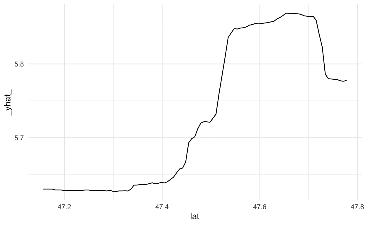
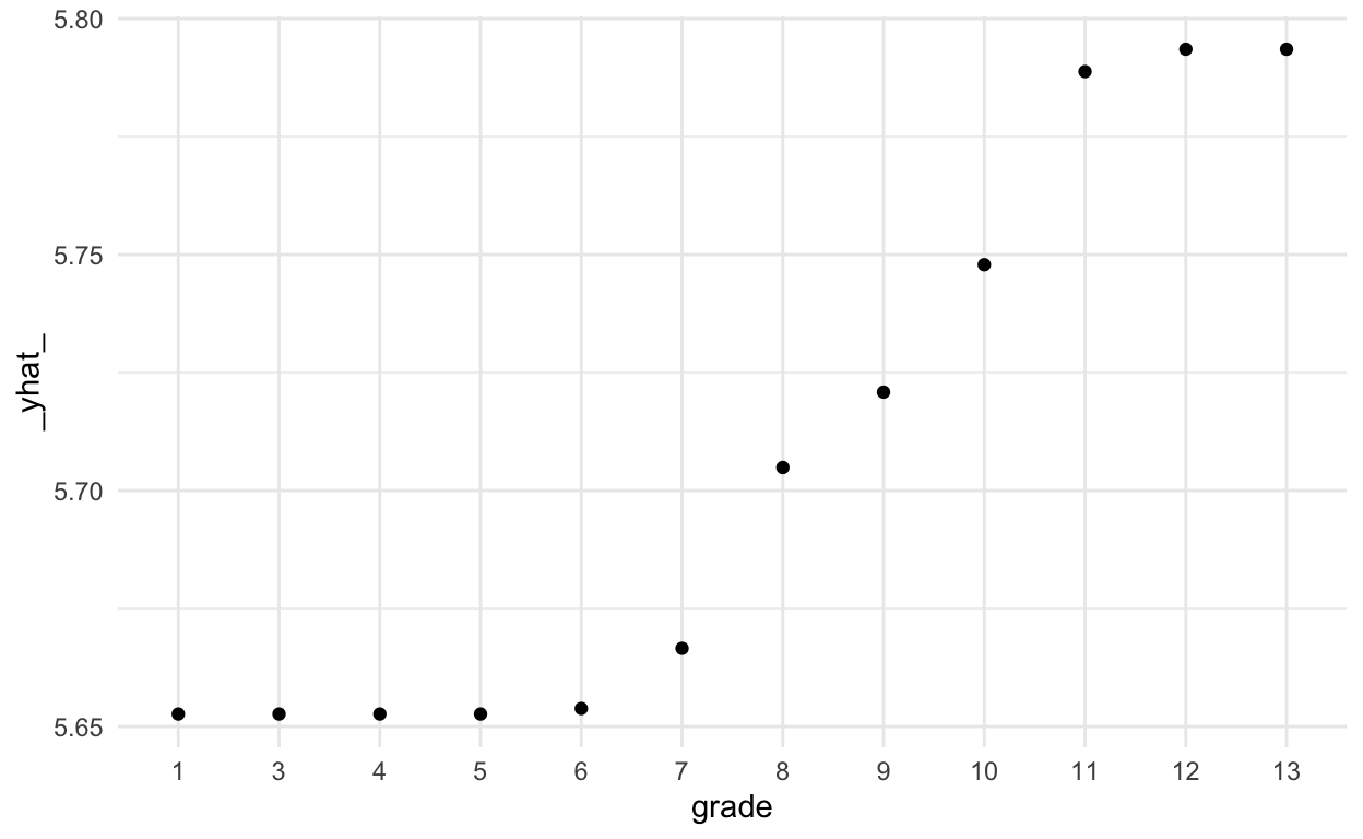
What if we want to examine a categorical variable? I chose to do this with geom_point(). You could also use geom_col(). In this case, since grade has an order to it, we could have also used geom_line(), but that wouldn’t be a good idea for an unordered categorical variable.
rf_cpp %>%
  filter(`_vname_` %in% c("grade")) %>%
  ggplot(aes(x = grade,
             y = `_yhat_`)) +
  geom_point()
Partial dependence plots
As mentioned earlier, looking at CP profiles is really a local interpretation, not a global one. But they play a crucial role in partial dependence plots, which are a global model interpretation tool. A partial dependence plot is created by averaging the CP profiles for a sample of observations (for a formula-driven explanation, see Biecek and Burzykowski.
Let’s first create a plot. The gray lines are individual CP profiles. The blue line in the partial dependence plot. I think it is useful to look at them together.
set.seed(494) # since we take a sample of 100 obs
# This takes a while to run.
# If we only want to examine a few variables, add variables argument to model_profile. If I remove that, it will do it for all variables and takes longer to run.
rf_pdp <- model_profile(explainer = rf_explain,
                        variables = c("sqft_living"))

plot(rf_pdp,
     variables = "sqft_living",
     geom = "profiles")

We could also look at the PDP alone.
plot(rf_pdp,
     variables = "sqft_living")

Let’s see how this differs for the lasso model. We see the parallel curves, again do to lasso being additive.
set.seed(494) # since we take a sample of 100 obs
lasso_pdp <- model_profile(explainer = lasso_explain,
                        variables = c("sqft_living"))

plot(lasso_pdp,
     variables = "sqft_living",
     geom = "profiles")

NOTE: PDPs are only available for numeric variables.
What’s next?
The next tutorial will cover local model interpretation. We’ve already seen one way of doing that with CP profiles. If you want to start reading ahead of time, check out the Instance Level chapters of Explanatory Model Analysis.